
AUTODESK
View Member Projects: Scaling Project Visibility in Autodesk Construction Cloud
How a design thinking approach solved challenges of one of the largest video management softwares in the market
Context
About the product
Autodesk Construction Cloud (ACC) is a enterprise SaaS product that allows construction project management and is used by over 1m+ customers. The Member Administration module which I worked on allows Account Admins to view and manage all the members in ACC.
- Autodesk Construction Cloud (ACC) is an enterprise SaaS product for construction project management with 1m+ B2B customers
- Helps teams streamline construction workflows by connecting tools & data
- The Member module I worked on allows admins to view and manage all the members in a construction company that have access to ACC
My Impact
- Designed the View Member Projects experience empowering admins with visibility of a member's project at scale
- Improved project visibility for admins by 60%
- Engaged 11,000 users in first week of launch
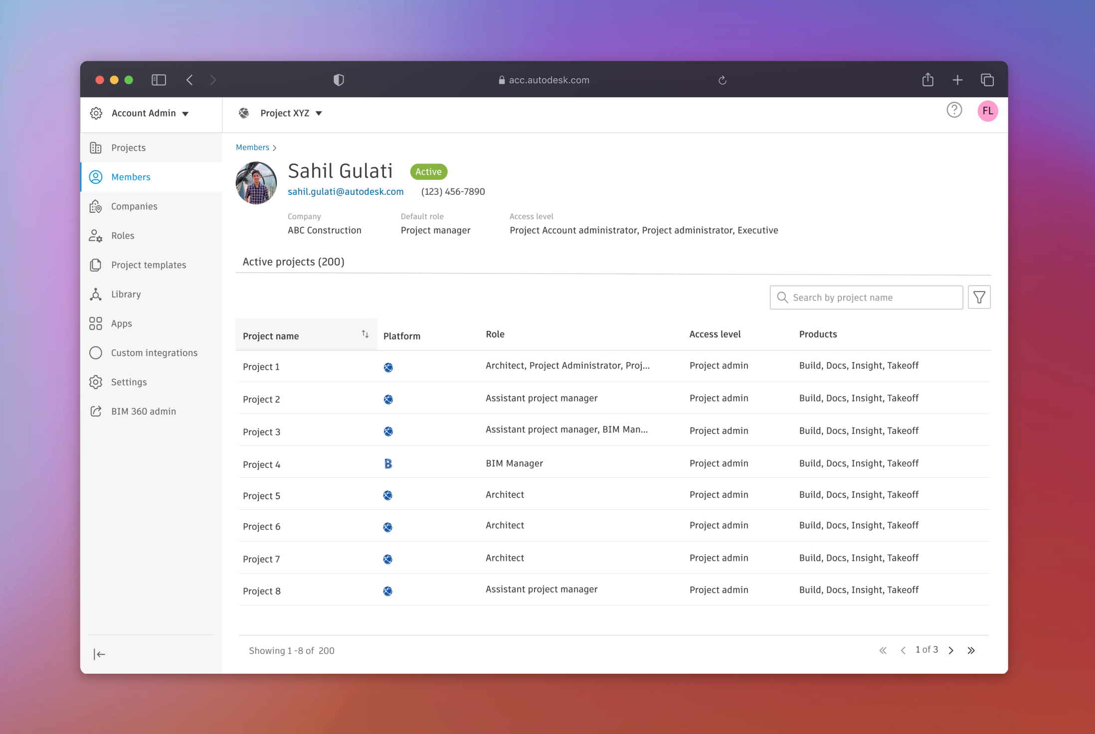
I led the design of View Projects of Account Members which improved the projects visibility by providing a centralized view of a member's projects to account admins along with relevant details like access levels, roles, and assigned products.
InFO
UX Designer
Interaction design, Visual Design, Prototyping, Technical Feasibility check, UX Reviews
3 Months (Sep'24 - Nov'24)
UX Researcher, Sr. Design Manager, Product Manager, Engineering Manager, Content Designer, 4 Engineers
Problem overview
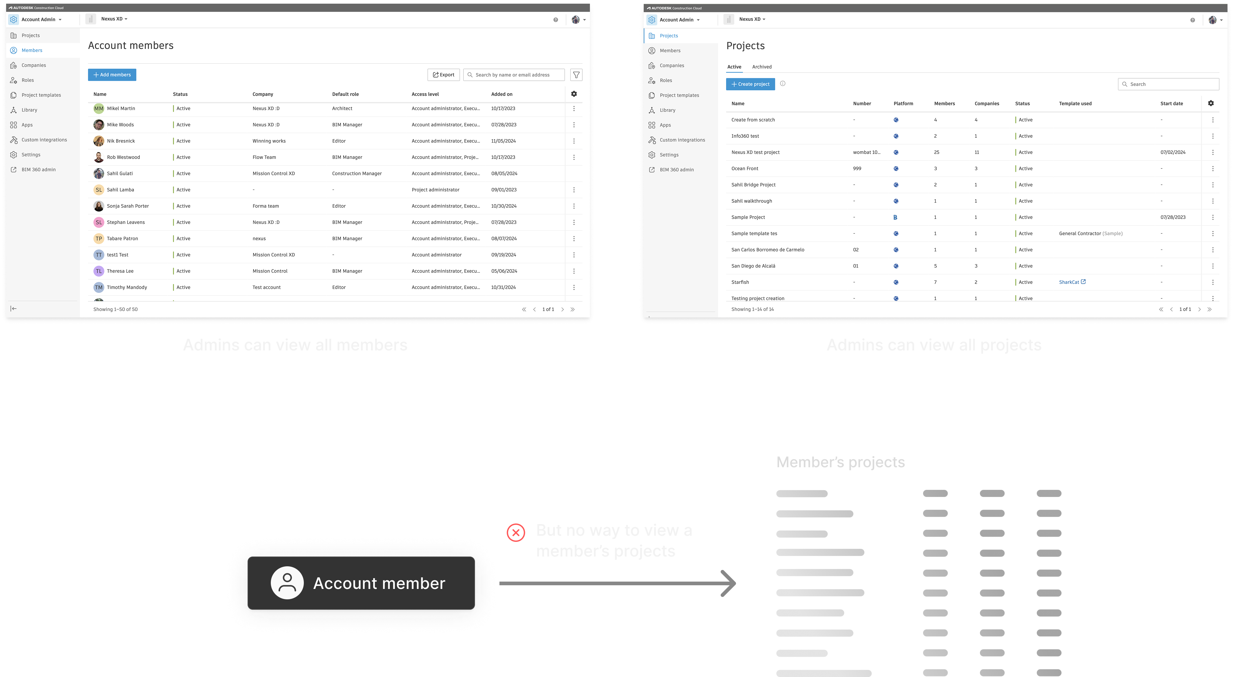
- Admins had to go in each project page one by one & verify if members were included on the proper projects
- Doing this for hundreds of members and dozens of project made the workflow inefficient
- This View Member Projects feature was a long pending request by customers which was not available in ACC yet unlike other Autodesk products like BIM 360
Process
Process Overview
DISCOVERY
When I started, I had minimal formal research available so I leveraged these 3 key customer feedbacks from Autodesk Annual Conference 2024 helped me understand account admin needs
I facilitated collaborative brainstorming sessions with my team to map out journey maps and translate key problems into 3 opportunities to solve for during the redesign
I have to visit each project to see where if member is assigned, it’s tedious!!
Admins lacked a centralized way to view a member’s project assignments, roles, and access.
BIM 360 has this feature, but ACC doesn’t, why the inconsistency?
Admins lacked a centralized way to view a member’s project assignments, roles, and access.

There’s no easy way to view project-level access/roles for large teams.
Admins lacked a centralized way to view a member’s project assignments, roles, and access.

Business State
- Pending Feature Request by Users
- Parity gap with other Autodesk products

Target Users
- IT Managers
- General Contractors
- BIM Managers

Success Metrics
- Feature Adoption
- Increased Visibilty
- Scalability for future

Constrains
- Tight Deadline
- Minimal Research Data
- No Product Spec
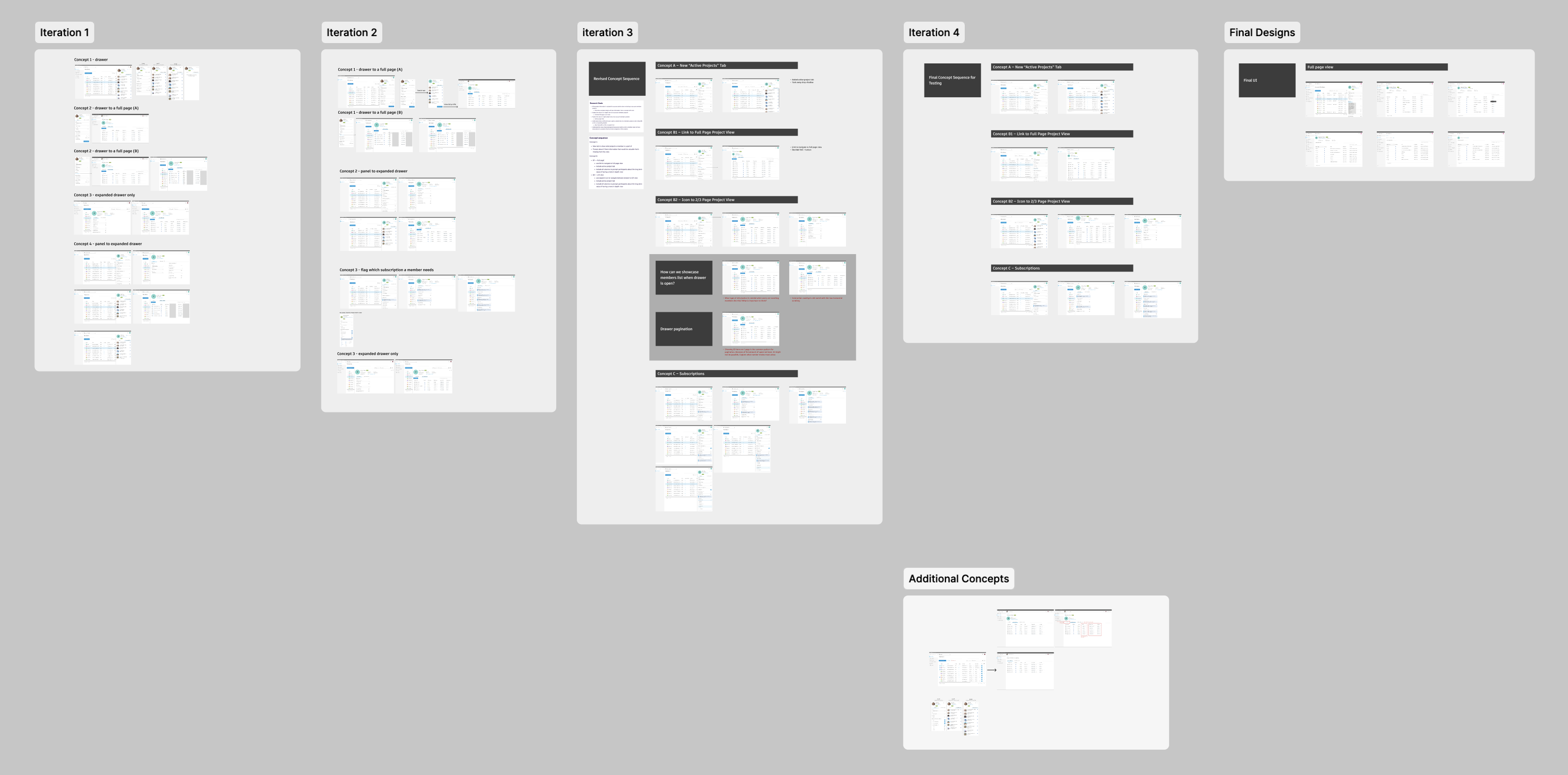
Design Iterations

1
2
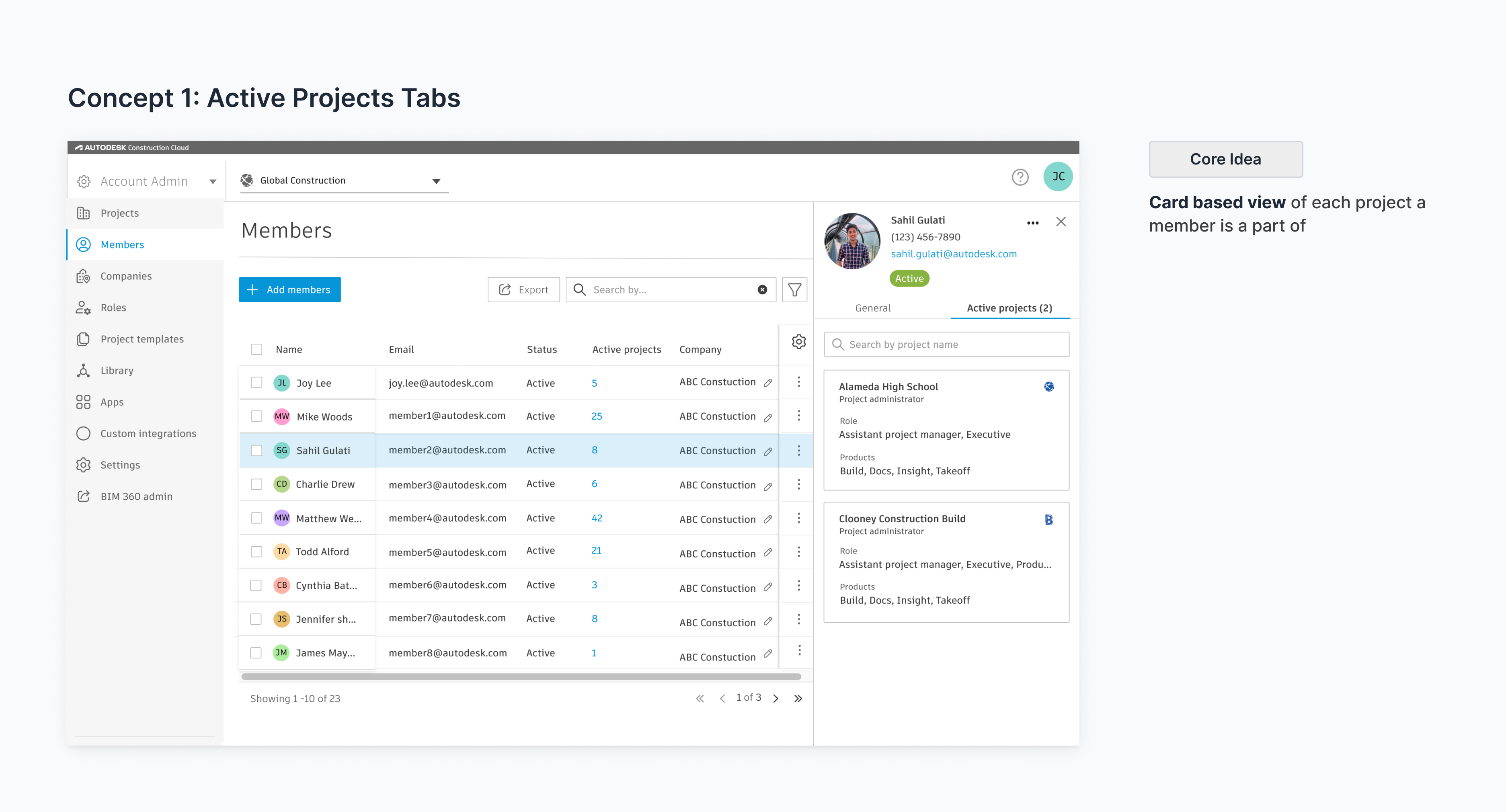
Concept 1: Active Projects Tab
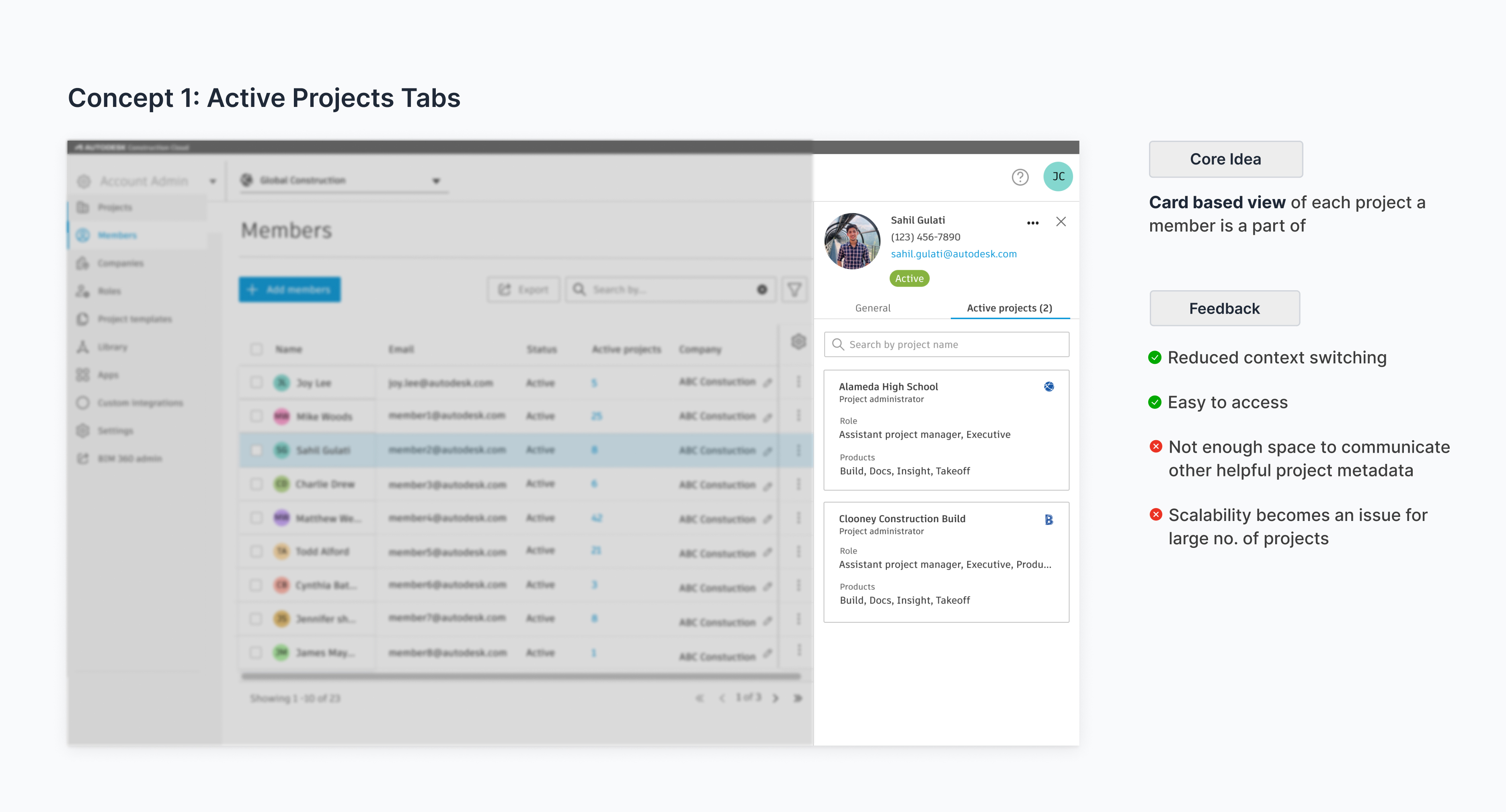
Concept 1 Feedback
1
2
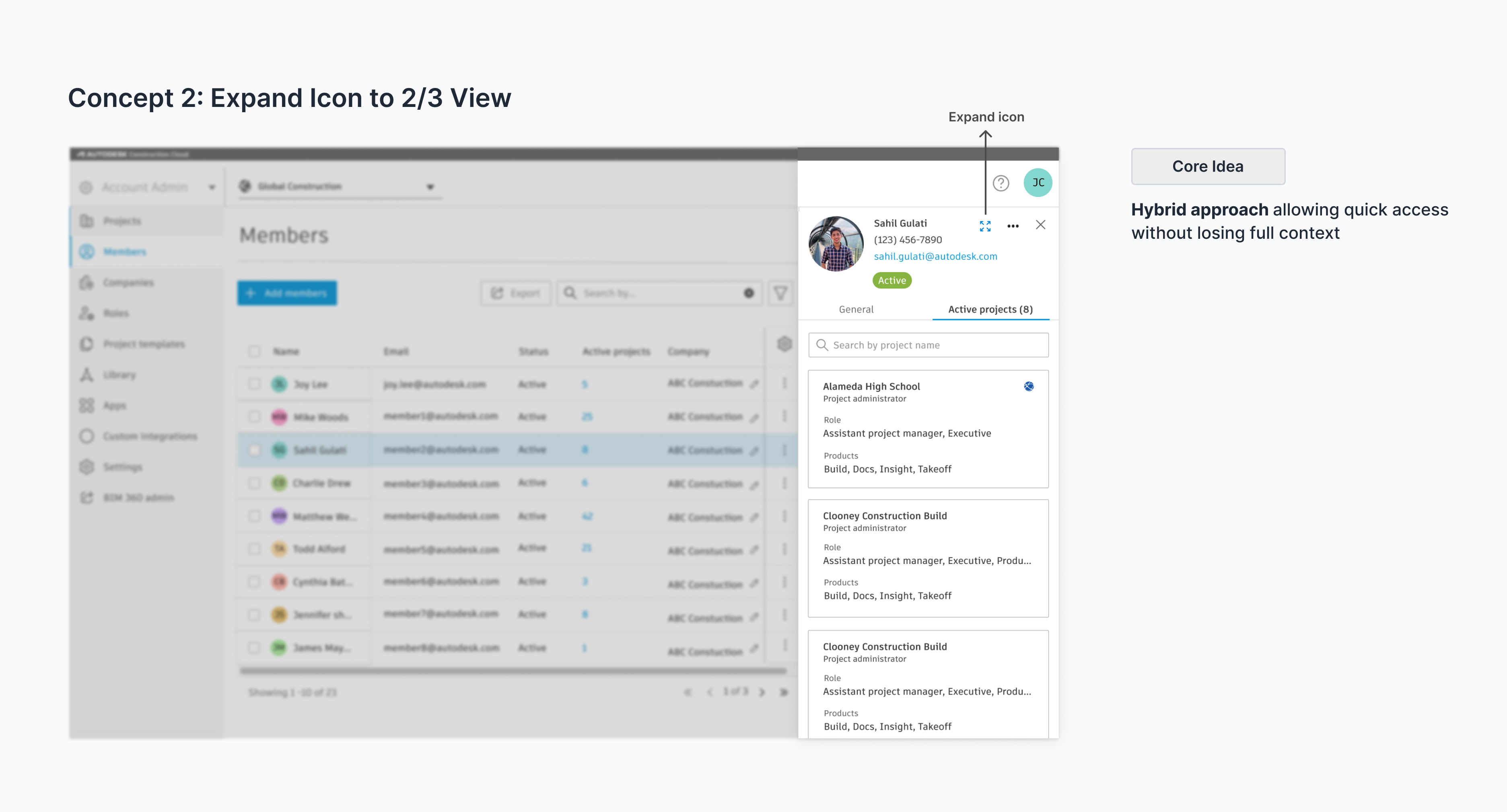
Concept 2: Expand Icon to 2/3 View
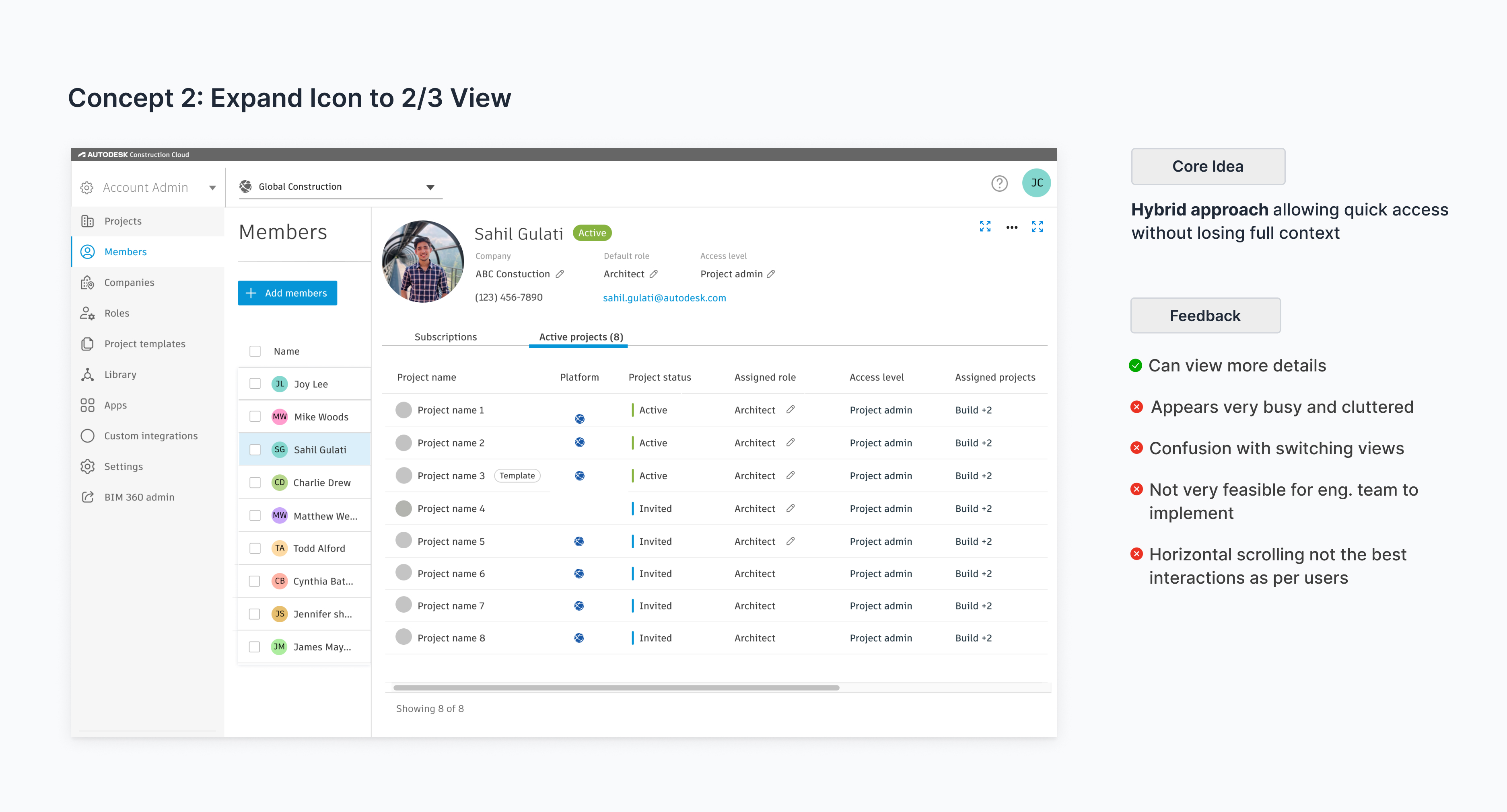
Concept 2 Feedback
1
2
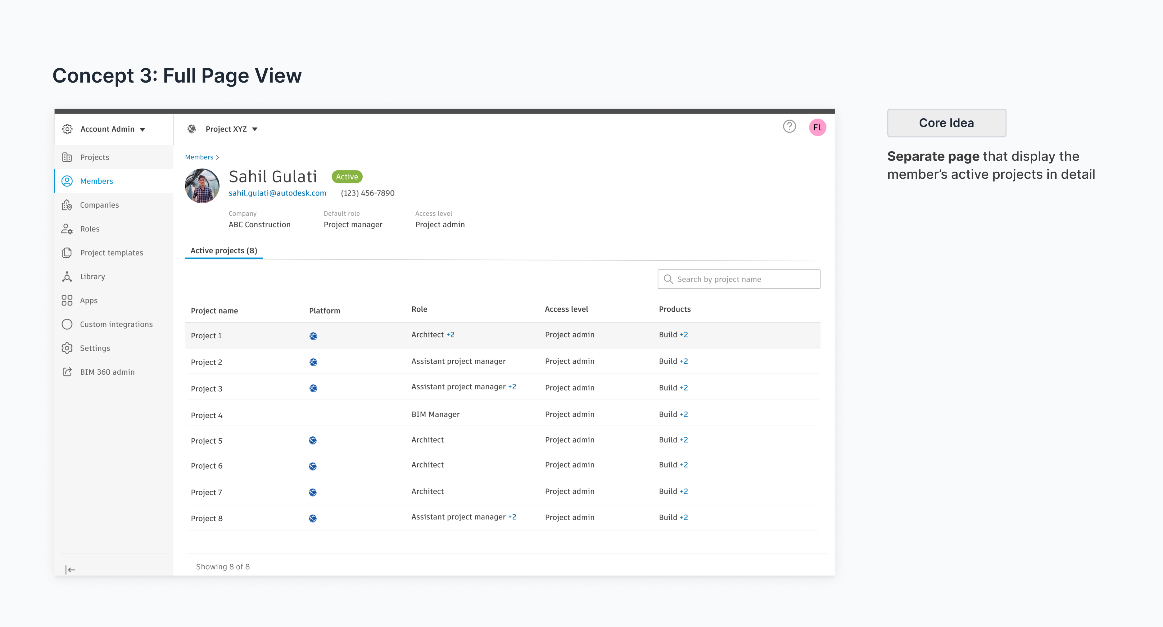
Concept 3: Full Page View
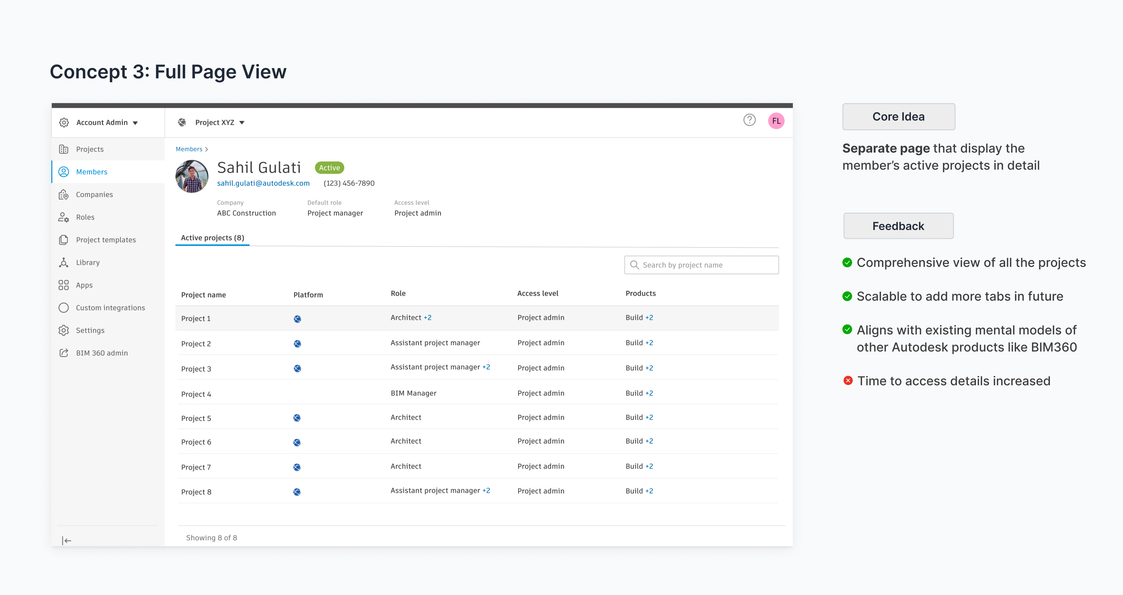
Concept 3 Feedback
1
2
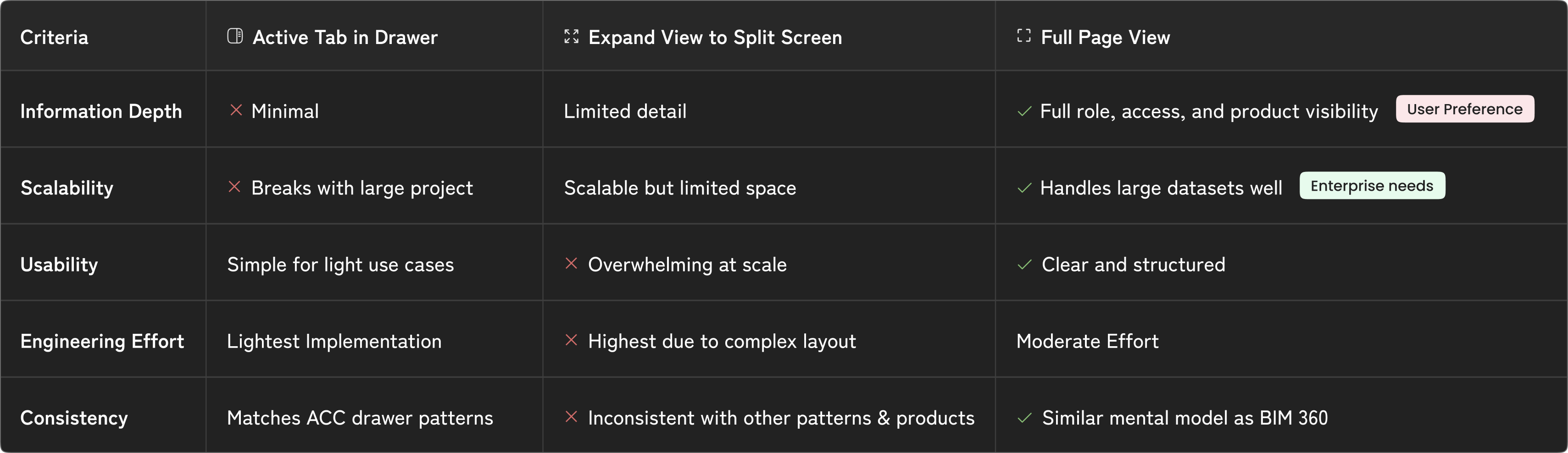
Comparison table for concepts
1
2
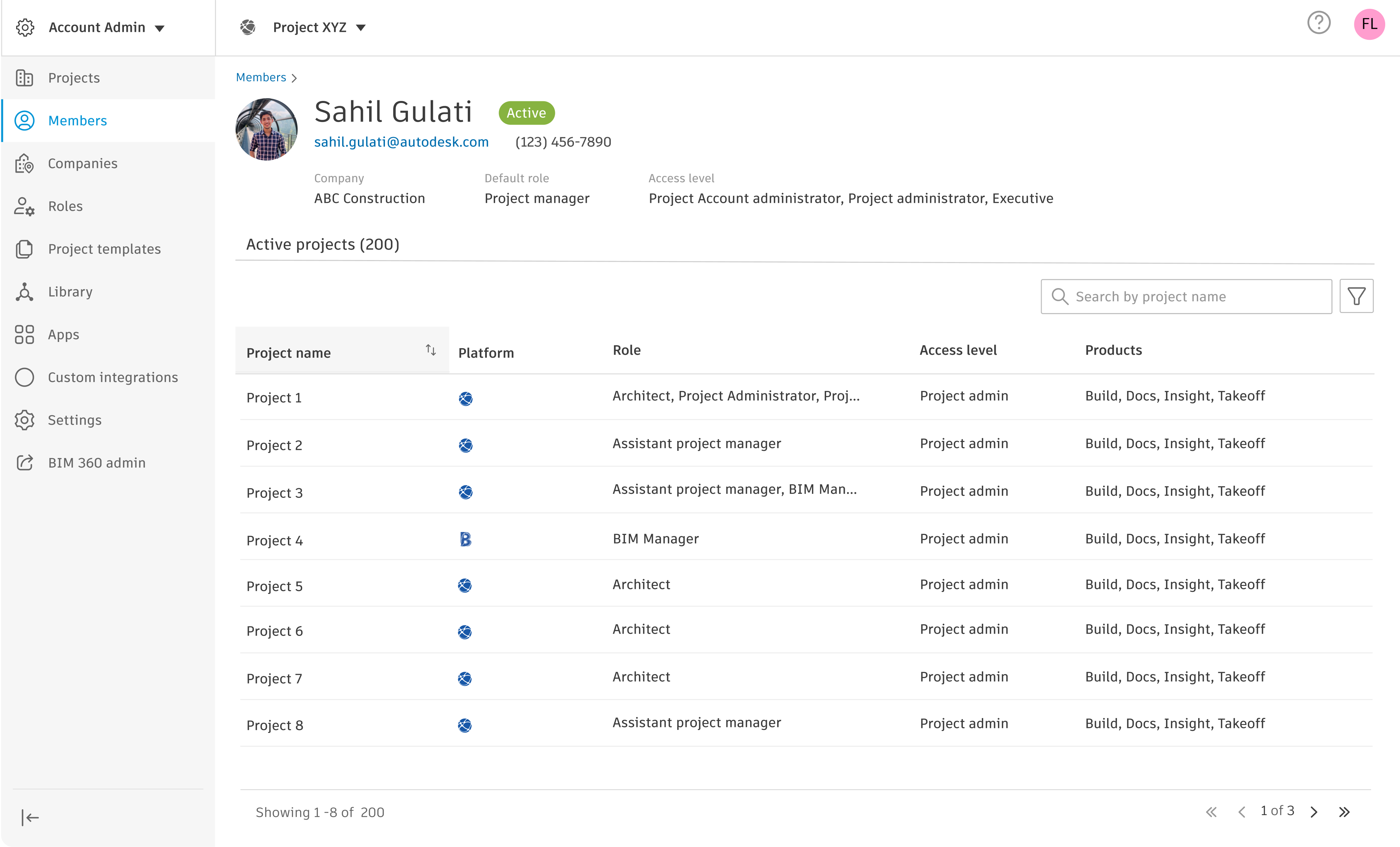
FInal Designs
Based on above criterias, I went with Full-page view that enables admins to view, search, and manage all projects associated with a member in a scalable and detailed interface.
Click to pause/play
1
2


Interaction Design IDeation
Crafting the optimized dashboard for Visual Clarity
Club cards display the basic information to identify the club before clicking to view more. They play a dominant role in shaping the visual experience. Therefore, this singular piece went through the most iterations by far.

