 Amazon
Bringing visuals to Gen-AI talent planningfor 350k+ employees
How I designed the patterns that let the Amazon AI answer
with org charts and metrics, not walls of text.
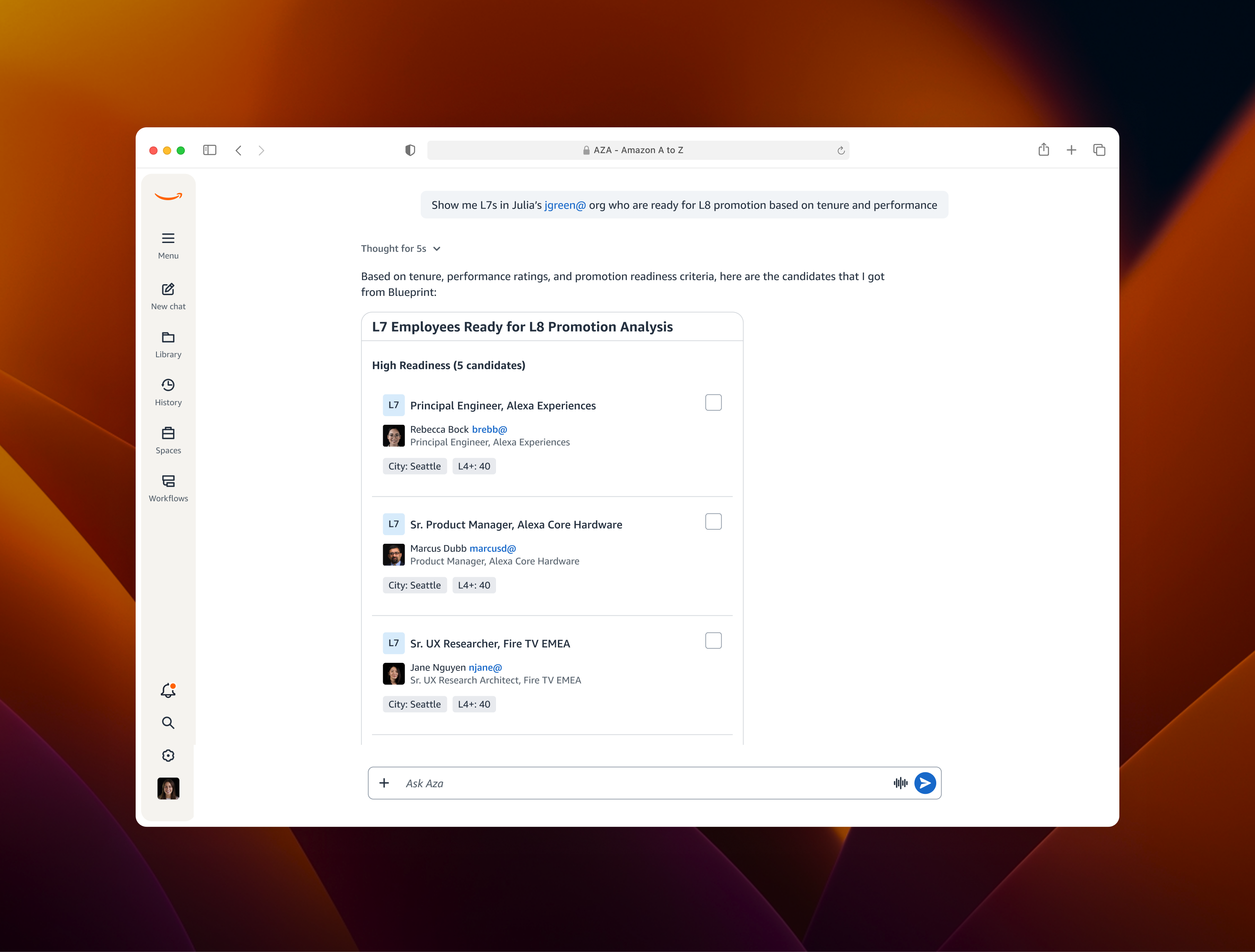
When you ask your fav Gen-AI for the weather, you get a weather card. It's like loading visuals on the fly.

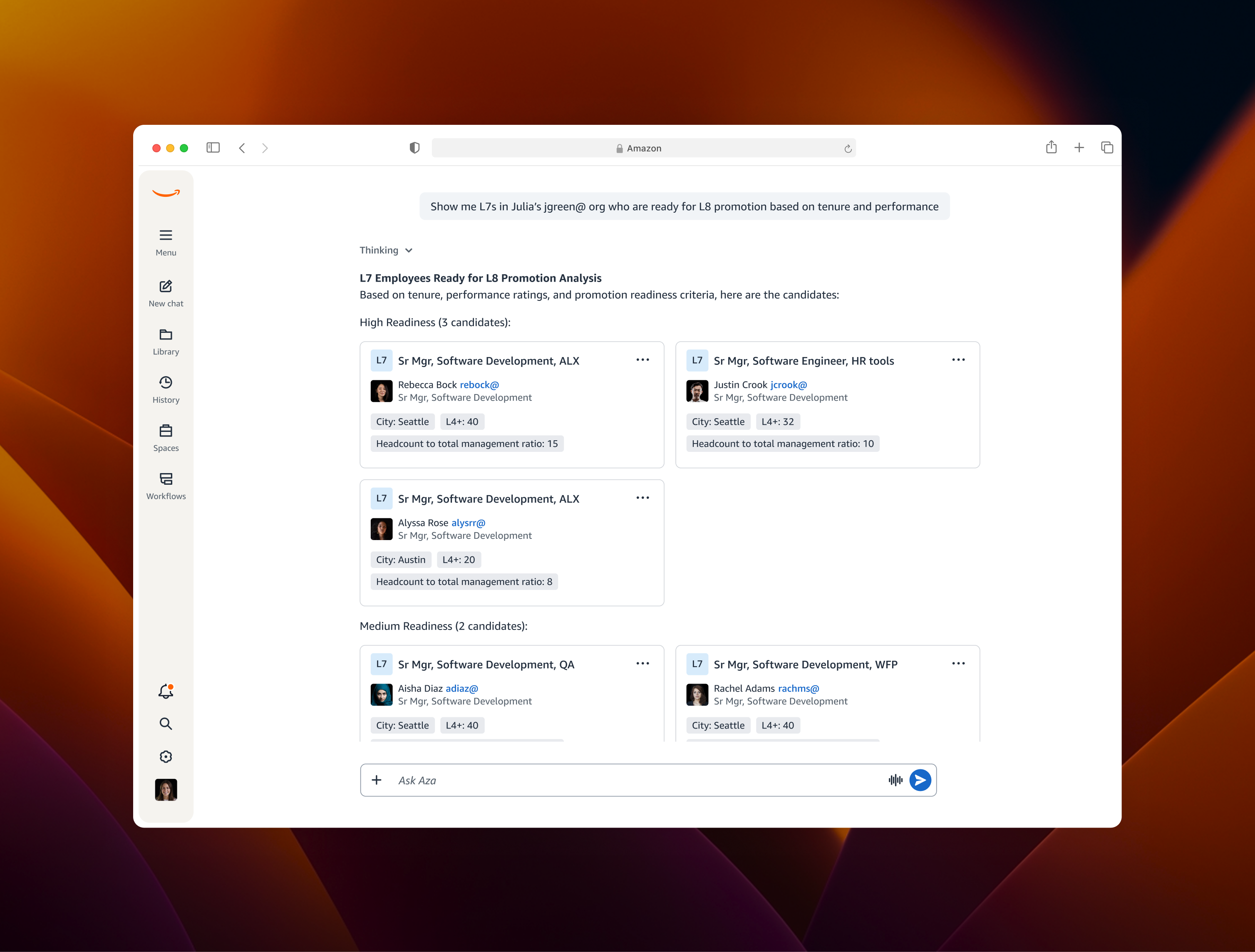
Aza, Amazon's Gen-AI chatbot, couldn't do that yet. It answered talent planning questions in text, even when the question was inherently visual ("show me promotion-ready L7s in Julia's org"). Meanwhile, Blueprint had a rich library of org charts, employee cards, and readiness indicators, but they lived in a separate product.
Visuals on Fly (VOF) brought Blueprint's visual language into Aza conversations. As the lead designer, I owned the curation, rendering, and transition patterns that defined how this new kind of response should work.
Talent planning is visual work, trapped in a text box
- HRBPs think in org charts, candidate lists, and reporting lines, not paragraphs.
- Aza could only respond in text, so complex answers turned into wall of words.
- Anything structural required leaving Aza for Blueprint, breaking the conversational thread every time.
Sole designer, owning three challenges
I partnered with PMs from the Blueprint team and got design review from designers on the Aza team. I owned the design end to end:
- Curation — which Blueprint visuals belong inside a conversation.
- Rendering — how those visuals should look and behave in a chat surface instead of a dashboard.
- Transitions — when to answer inline vs. hand off to Blueprint.
Talent planning was a multi-step workflow spread across tools.
An HRBP could get an insight in Aza, then had to jump to Blueprint and rebuild context to act on it. So I redesigned the journey to keep each answer in the conversation, with every response setting up the next decision.
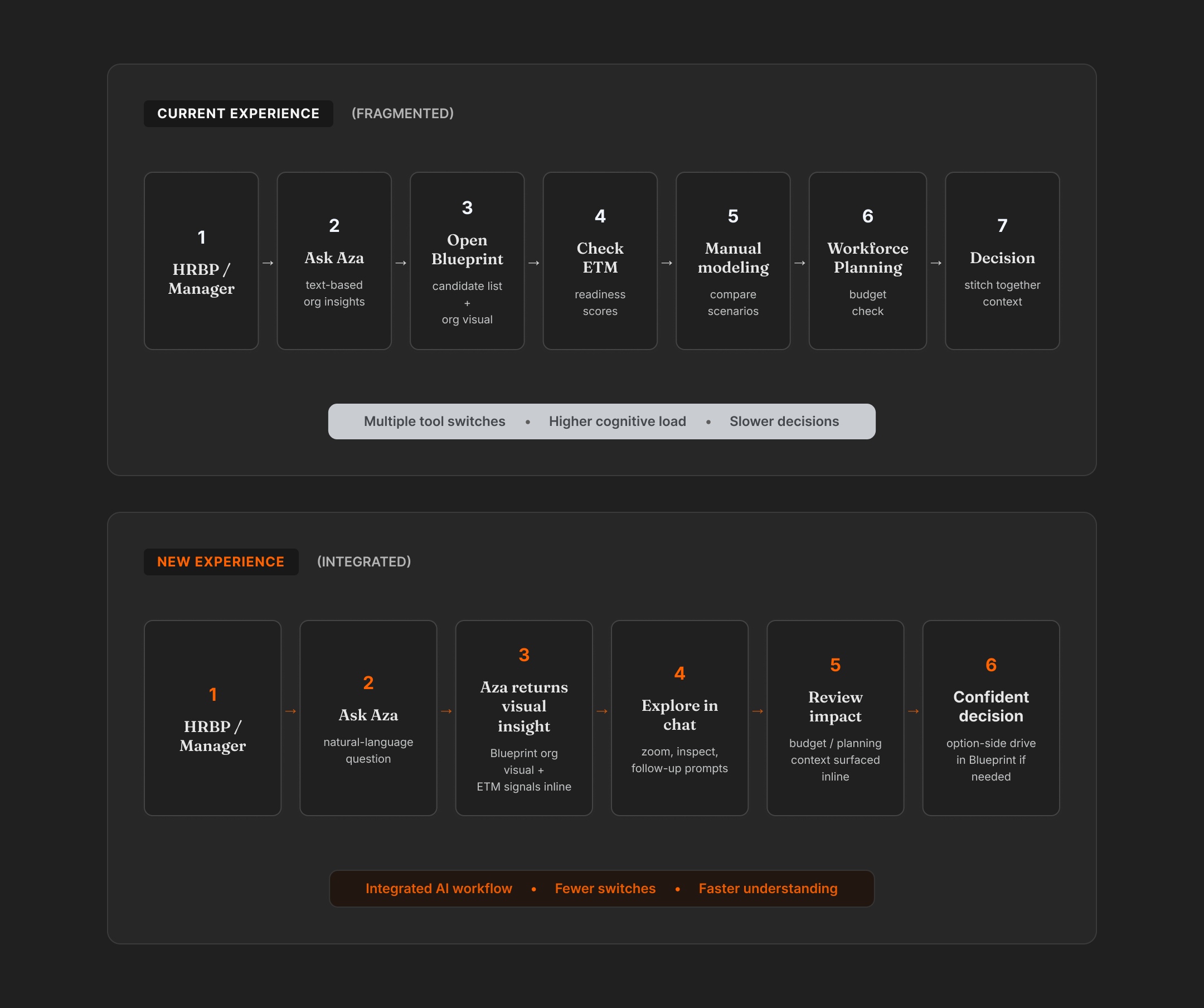
In the product, that journey became three connected turns. Each answer narrows the problem and hands the user a stronger next step, instead of sending them back to start over somewhere else.
Four calls that shaped UX
1. How I decided which Blueprint visuals translate to AZA?
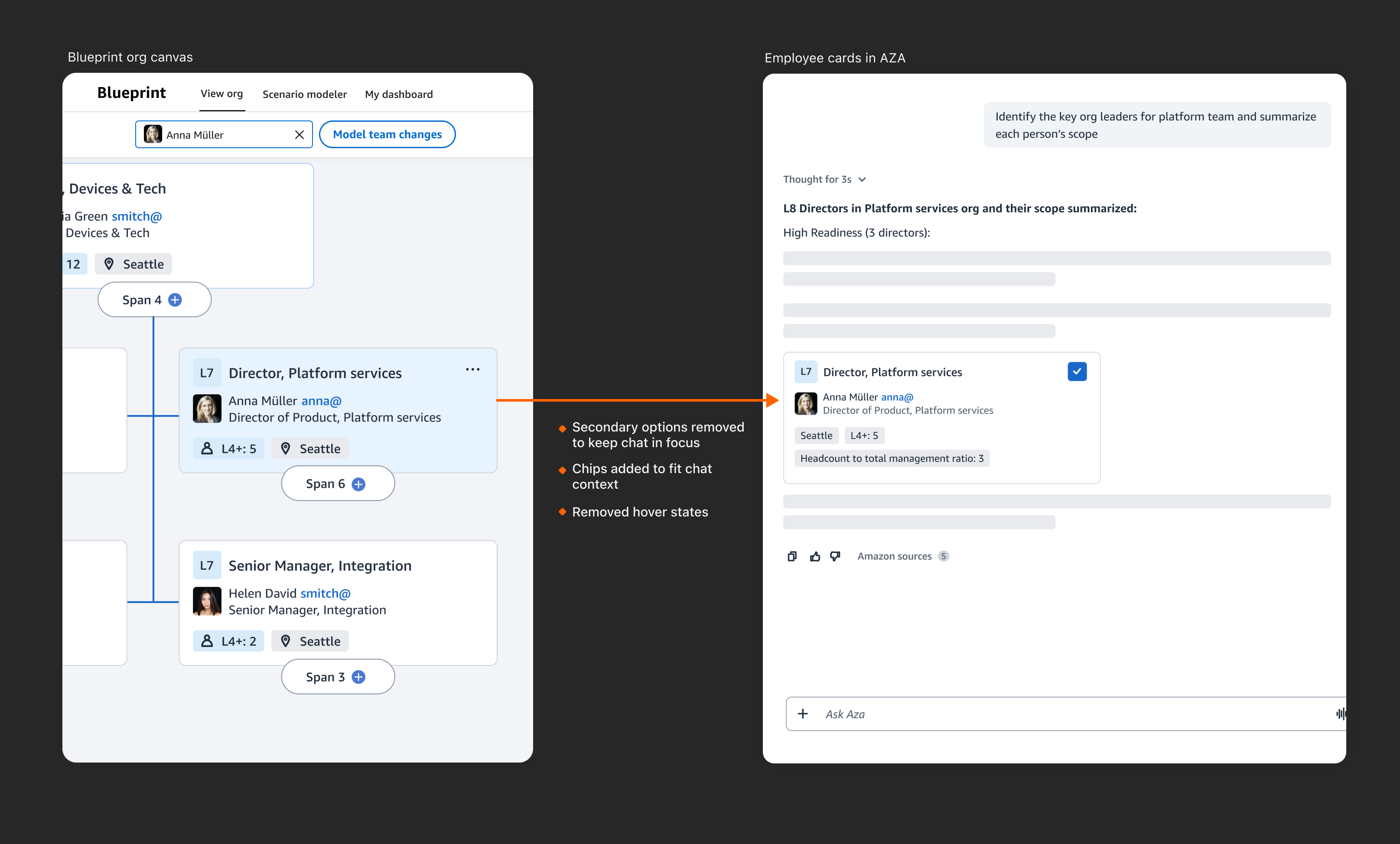
- Blueprint has dozens of components built for a full dashboard, and most don't survive translation to AZA. I made tradeoffs decisions to these components mentioned in the below table.
| Blueprint | Decision | Why |
|---|---|---|
|
Employee Cards
Level, photo, role

|
Translated |
|
|
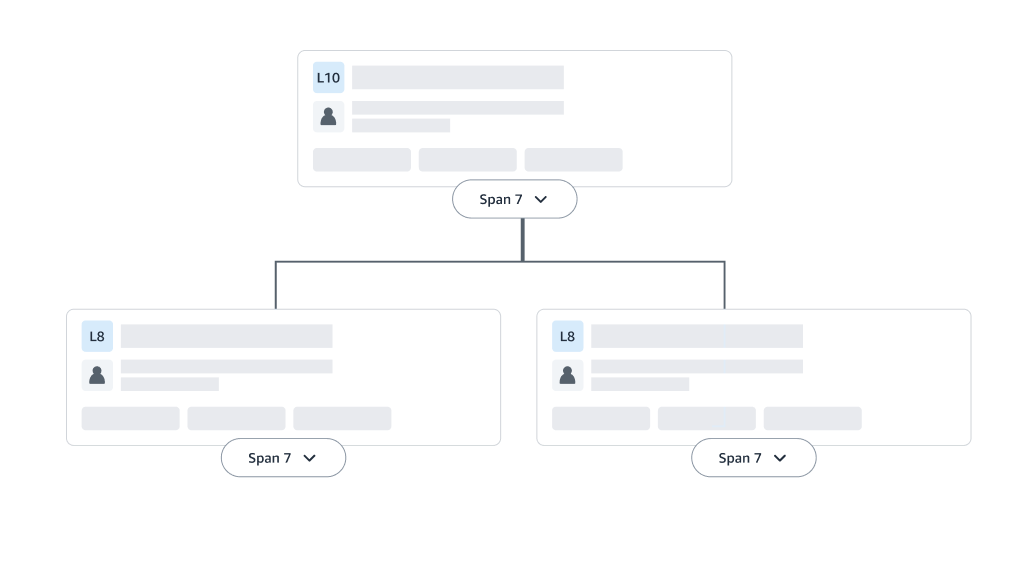
Org chart tree
Metric tiles, level mix, ratios
|
Translated |
|
|
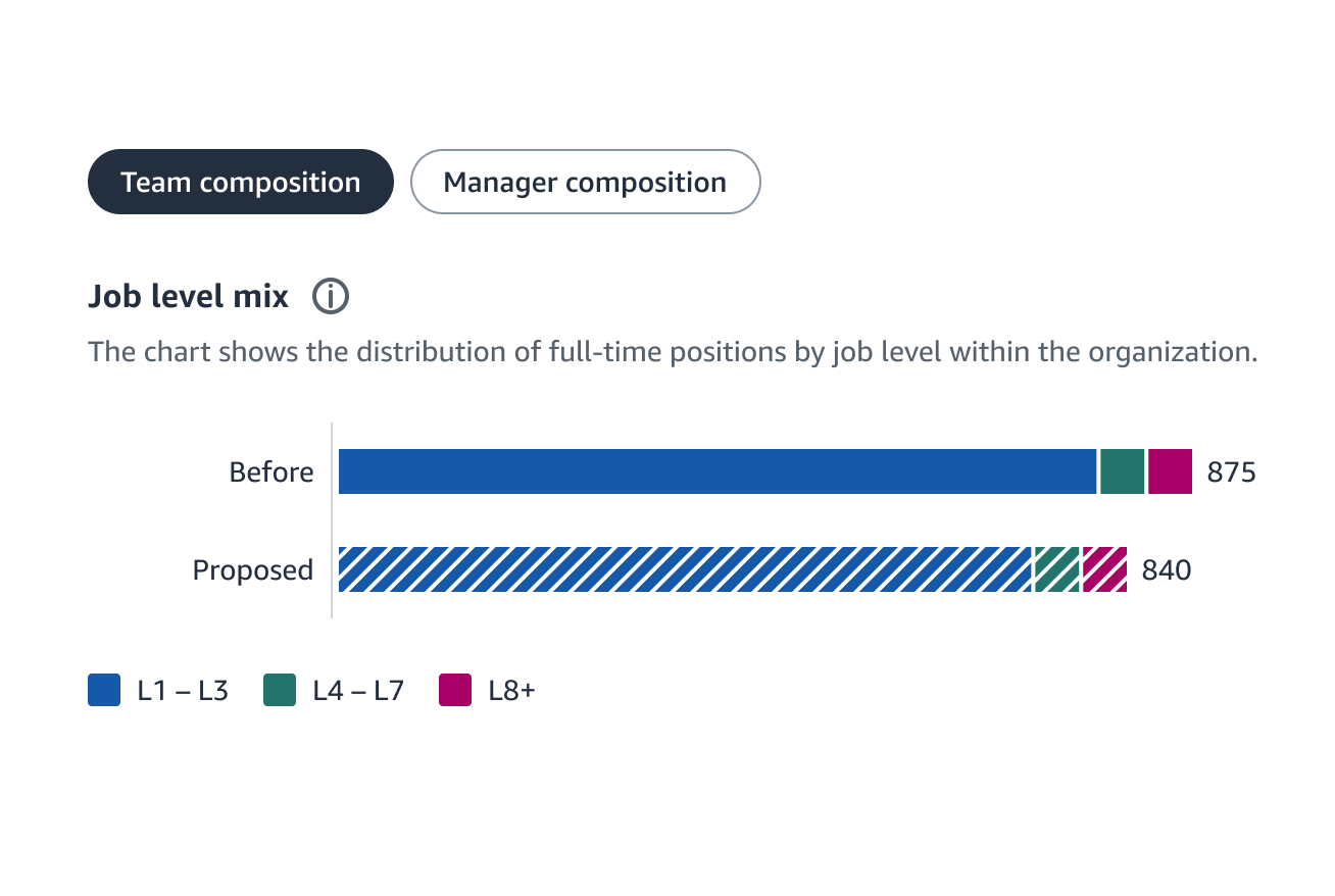
Job level mix
Level distribution, composition
|
Translated |
|
|
Multi-tab nav
View org, Scenario, Dashboard

|
Rejected |
|
|
Scenario entry
Person picker + action button

|
Rejected |
|
|
Zoom toolbar
Floating view + zoom controls

|
Rejected |
|
These components were translated by keeping the core Blueprint signal intact, then reshaping it for chat. The image below shows one example of how an employee card was adapted into a compact, inline answer.
2. Designing visuals to carry states, not just static data
- Most useful pattern was visuals that show what changed, not just what is.
- Org Impact Overview tags nodes with their state directly on the chart: a "new position" banner, a "manager change" banner, and an inline warning when a promotion falls outside the org's region.
- HRBP read the consequence of a decision without parsing a table.
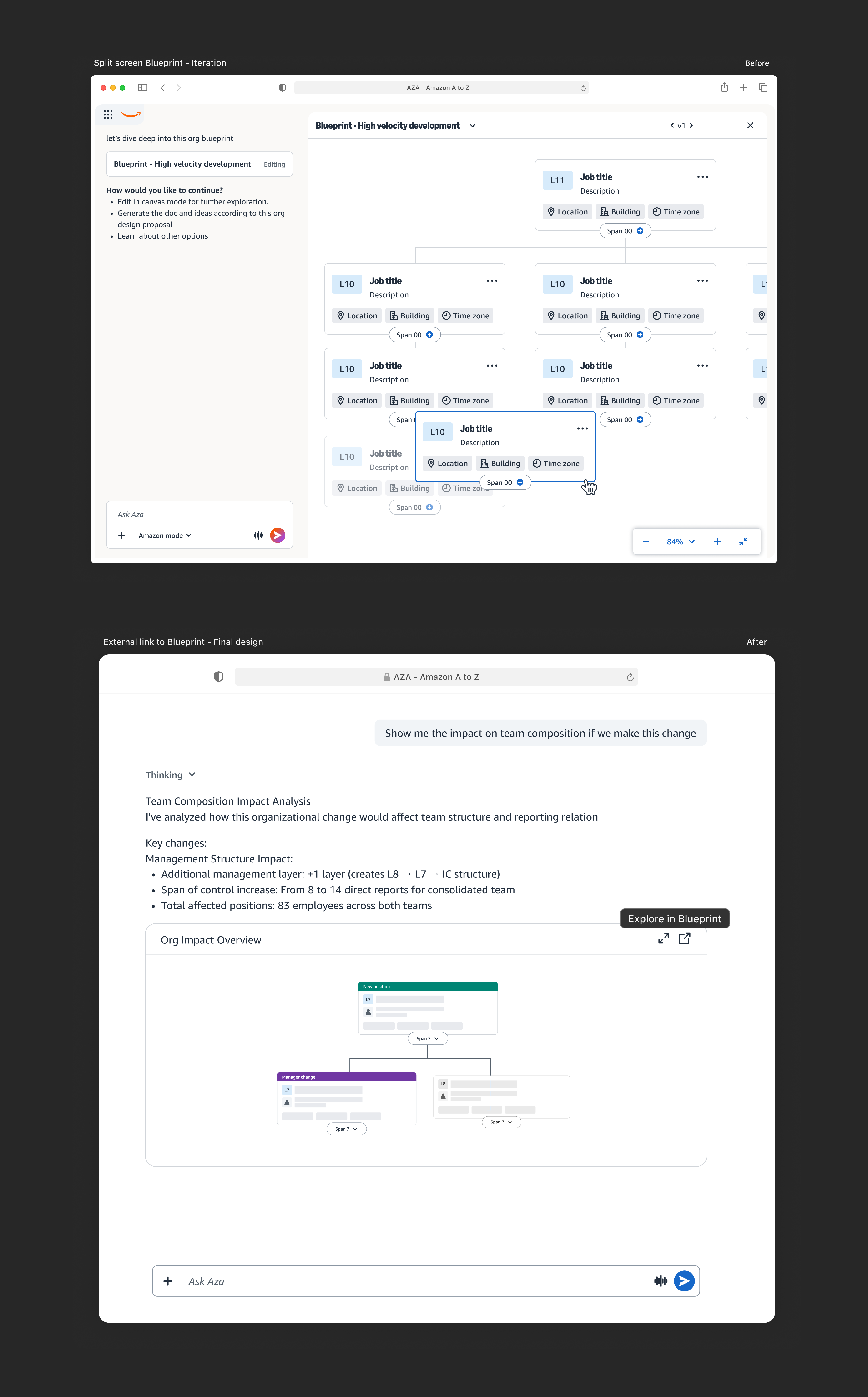
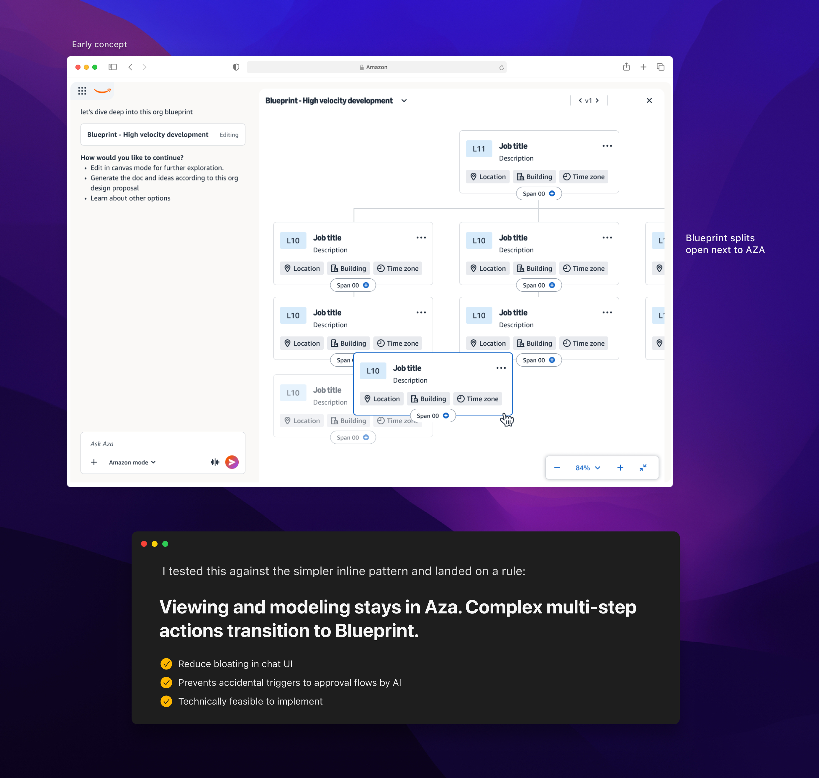
3. I tested split-screen integration but complex org modeling requires handoff to Blueprint
- Modeling a multi-step reorg or running deep scenario analysis needs Blueprint's native features and its full canvas, therefore these actions require redirect to Blueprint .
4. Defining guardrails for AI to prevent irreversible decisions
During my first week at Amazon I learned about "one-way door decisions" i.e. choices that can't be undone once made. Even though our goal was to empower HRBPs with faster talent planning, we had to be careful about how much we let Aza execute on a user's behalf. So I designed guardrails around approval flows that keep Aza out of any one-way door decisions, no matter how confident the AI sounds.
| AZA Non-executable actions | Explanation |
|---|---|
|
Marking employee ready or not ready for promotion
|
Affects the org review and create bias towards certain candidates. |
|
Submitting a promotion request
|
Since it's in the approval queue, the candidate, manager, and committee all see it |
|
Notifying employees about promotion decisions
|
Early phases of promotion planning restricts employee involvement or notification |
How collaboration and feedback from AZA team refined designs
From 0->1 to 1->N, working with the AZA team helped me refine the experience around AZA's conversational model, constraints, and expectations.
Visuals to help not overwhelm
Visuals on Fly should compliment the existing conversational flow but not overwhelm it.
Tighter information density
Combine multiple visual components into one, improving load performance.
Follow-up prompts
For non-deterministic workflows, guide next user action using contextual follow-up prompts.
Talent planning becomes simpler with visuals on fly
HRBPs now ask Aza a talent planning question in plain language and get a visual response inline. Live org charts, candidate cards, and readiness indicators render directly in the chat thread, composed from Blueprint and ETM data behind the scenes.
With great AI comes great responsibility
I experimented, failed sometimes and eventually learnt how to define guardrails around AI for talent planning which preserved the user's trust in AZA and onboard more teams to use it.
The biggest challenge was choosing the right visuals for the chat because Blueprint had a big component library built for a full dashboard, and it was tempting to bring everything across. The harder discipline was curating carefully meaning keeping only the components that carried their meaning inside the chat, and rejecting patterns that were not relevant to AZA.
Shipped, and reusable
The pilot's real value wasn't the feature. It was proving that an agentic chat could compose visual responses from a separate product's component library and chain them across a real decision

AMAZON
Building dynamic
HR agentic chat
experience
How I designed the patterns that let the Amazon AI answer
with org charts and metrics, not walls of text.
Autodesk Construction Cloud (ACC) is a enterprise SaaS product that allows construction project management and is used by over 1m+ customers. The Member Administration module which I worked on allows Account Admins to view and manage all the members in ACC.
I led the design of View Projects of Account Members which improved the projects visibility by providing a centralized view of a member's projects to account admins along with relevant details like access levels, roles, and assigned products.
The short version
TL;DR
Autodesk Construction Cloud (ACC) is a enterprise SaaS product that allows construction project management and is used by over 1m+ customers. The Member Administration module which I worked on allows Account Admins to view and manage all the members in ACC.
- When you ask ChatGPT or Gemini for the weather, you get a weather card. Ask it about a stock, you get a chart. The visuals are integrated inside the responses.
- Aza, Amazon's internal HR chatbot, couldn't do that yet. It answered talent planning questions in text, even when the question was inherently visual. Meanwhile, Blueprint had a rich library of org charts, employee cards, and readiness indicators, but they lived in a separate product.
- Visuals on Fly (VOF) was the design effort to bring Blueprint's visual language into Aza conversations. I contributed to the curation, rendering, and transition patterns that defined how this new kind of response should work.
I led the design of View Projects of Account Members which improved the projects visibility by providing a centralized view of a member's projects to account admins along with relevant details like access levels, roles, and assigned products.
InFO
UX Designer lead
6 weeks (Dec'26 - Jan'26)
SLX - Senior leader experiences + AZA product management & design
Shipped to pilot; 30–40 pilot users enabled
Problem overview
- Talent planning is visual work: HRBPs think in org charts, candidate lists, and reporting lines, not paragraphs.
- Aza could only respond in text, so complex answers turned into walls of bullet points. Anything structural required leaving Aza for Blueprint, breaking the conversational thread every time.
- The opportunity: do for HR what weather cards did for ChatGPT, letting the agent compose visual responses inline using a component library Blueprint had already built.
Key Design Decisions
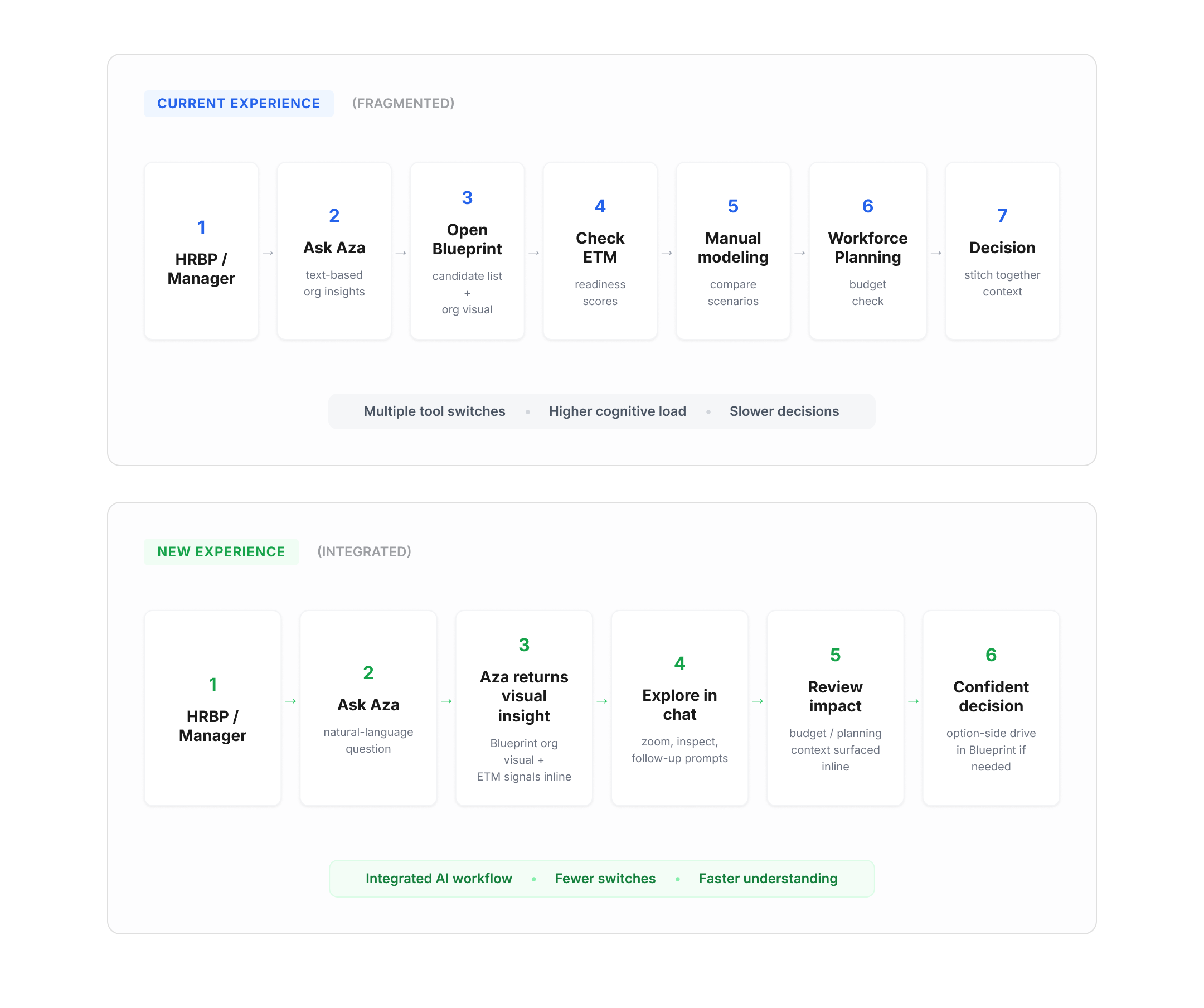
HRBPs used to bounce between Blueprint, ETM (Executive Talent Management), and workforce planning to answer a single promotion question racking up multiple context switches before they could even make a decision.
We made tool-switching itself the design constraint: Aza pulls from all three sources behind the scenes and composes one visual response, so readiness, structure, and headcount appear in a single unit instead of three separate lookups.
Key Design Decisions
Early concepts focusing on the new customer journey explored split-screen "canvas mode" where Blueprint would open alongside the chat for complex org interactions.
Key Design Decisions
When result sets got large, the question was whether to add traditional filter controls or keep the interaction conversational. We landed on client-side filtering: Aza sends the full data set once and filters locally, so follow-up refinements happen instantly without new API calls. This let users narrow results through conversation ("just the ones in Seattle") rather than wrestling with a sidebar of filter checkboxes.
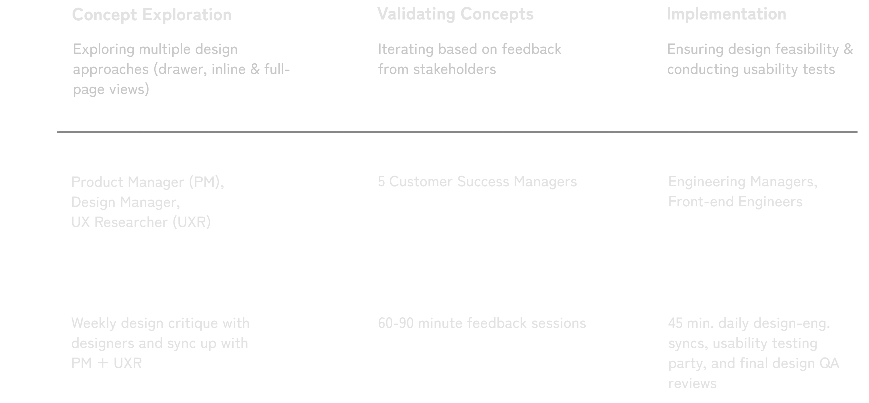
Process Overview


Interaction Design IDeation
Crafting the optimized dashboard for Visual Clarity
Club cards display the basic information to identify the club before clicking to view more. They play a dominant role in shaping the visual experience. Therefore, this singular piece went through the most iterations by far.


